Listen to this blog
How to Link on YouTube When You’re Not a YouTube Partner
YouTube is the largest streaming video platform the world has ever seen – 2.1 billion users each month, watching 5 billion videos every day, uploading 300 hours of video every minute. With all that content and all those users viewing videos to educate and entertain themselves, YouTube is also the world’s second-largest search engine. As with Google (which owns YouTube), the search functions determine which videos are displayed and in what order. With an audience of that size, consistency, and engagement, it’s easy to see why YouTube is such a powerful place to market your business.
YouTube is Big. REALLY Big.
While YouTube is great for getting attention, the important steps for your business are finding, connecting with, and attracting visitors to your own website to purchase your products or services. But YouTube wants to keep people on their site watching videos. That’s why they restrict the use of links, and why you need a few tricks to get around these restrictions.
YouTube Linking Obstacles
YouTube limits the use of clickable in-video links to external sites to approved members of its YouTube Partner Program (YPP), AKA Partners. YPP’s qualification requirements are steep.
YouTube Partner Requirements
To become a Partner, your channel must have:
- Over 10,000 cumulative lifetime views (between all your videos)
- Over 4,000 watch hours in the last 12 months
- At least 1,000 subscribers
- Once the previous two requirements are met, YouTube must then review and approve your channel for partnership.
Most businesses with a YouTube channel don’t meet these criteria, but not to worry. Check out these tips to help you get your YouTube viewers back to your website.
Short Links: The Best Way To Link On YouTube
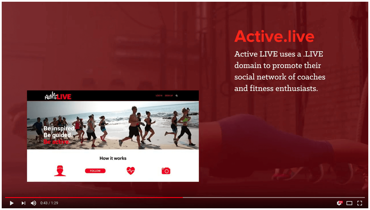
Try using a short, memorable word-based link in your video with an image that shows where it’s taking you.
A link doesn’t have to be clickable to get your viewers to use it. There are no restrictions on adding your URLs as text or saying them audibly in the video itself, but because your viewers have to take the extra step of typing it into the browser, you want to make this process easy for them.
Links That Pass the “Radio Test”
To help viewers remember your link long enough to type it in, make sure it:
Is Short: The goal is to have a viewer go to your link after hearing you mention it, so the link needs to be short enough to lodge in their short-term memory.
- Instead of this: https://www.bl.ink/blog/four-rules-linking/
- Try this: blink.news/links
Uses Real Words: Not only should you avoid ‘character gibberish’ in your link, but you should also use words that are meaningful to your audience, so that the link is more comprehensible.
- Instead of this: https://moz.com/beginners-guide-to-seo
- Try this: b.link/seo
Calls to Action: If possible, use action words in your link, so that your link reinforces the action you want users to take.
- Instead of this: https://www.jcrew.com/p/mens_category/denim_jeans/slim/484-slimfit-stretch-jean-in-dalton-wash/H7169?color_name=dalton-wash
- Try this: wash.shopping/get-slim-fit-jeans
Sight & Sound: Double Reinforcement
When including a link in your video, make sure it shows up in big bold text and add your voiceover, along the lines of, “Sign up now online for my class. Just go to your address bar and type ‘Learn dot marketing slash register’.” You can visually reinforce the link by showing it being typed into the address bar of a browser during the voiceover. Now you’re really driving home the message and maximizing clicks.
Tracking Your Link’s Clicks
When your viewers manually enter your short link, there is no way to attribute the traffic to your YouTube videos. The lack of tracking here disables you from analyzing your traffic to figure out which marketing tactics and channels are working. Using a link shortener that enables you to embed tracking and identification information is critical.
BL.INK: A Solution for Easy-to-Read, Trackable Short Links
BL.INK is a technology that turns long URLs into short links using real words that enable you to tell a story. It helps your YouTube fans get to any site or marketing asset you want, no matter how clunky and long the real link is. Plus, BL.INK links track clicks and can be given unique tags so you know which users are coming from which videos. BL.INK makes it easy to create two types of short links:
- Unbranded Links: These links use our shared b.link domain and allow you to customize the keyword (the part that comes after the ” / ” ).
- Branded Links: These are based on a short domain you buy to reflect your brand, and then customize to describe the specific content in the URL as you like. Branded Links are a quick and easy way to brand your user touchpoints at scale.
Ex. turn this blog (bl.ink/blog/youtube-linking-hacks) into the Branded Link blink.news/youtube-links
BL.INK short links in your video content are a great tip to move your users from YouTube to your website. Here are some more YouTube tips to get more clicks.
Link in Description: Hidden but Clickable
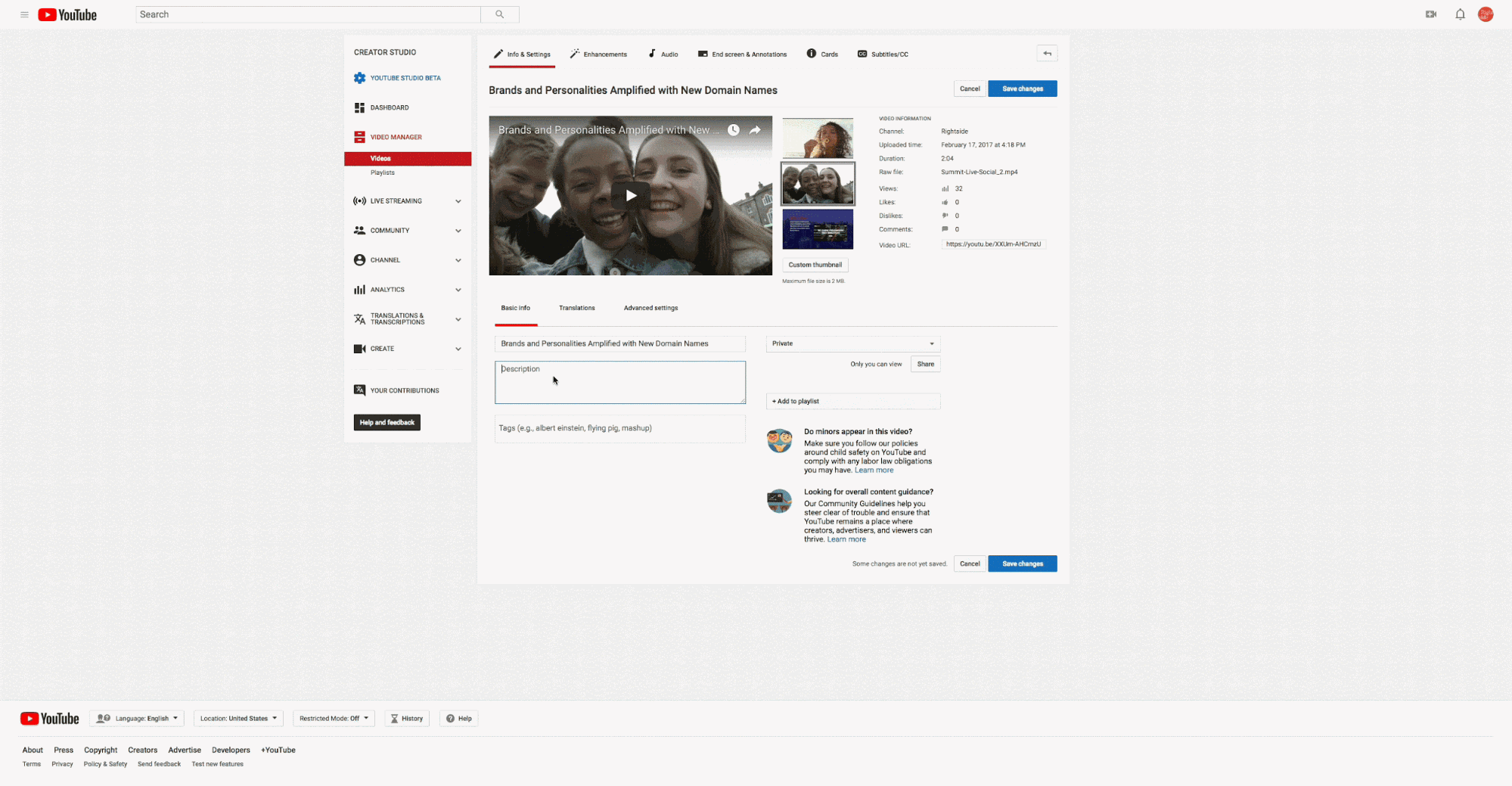
Insert a link in your video description in the Creator Studio.
Another place to put your links is within the video description. When you type something YouTube recognizes as a URL, it automatically becomes a clickable link. There really are no practical limits to the length or content of such links, but there are two issues to contend with:
No Anchor Text
YouTube links in the description are just text, and although they’re clickable, they can’t be set behind anchor text. That means you can’t hide anything you don’t want the user to see, such as an ugly URL or long tracking codes.
Hidden Below Your Video
The description is beneath your video, often making it hidden until the user scrolls down the web page. Not only that, but YouTube only allows a short amount of the description to be seen before hiding the rest under a “SHOW MORE” tag. Once this tag is clicked, the rest of your description will display.
The trick here is to use short links as vanity URLs. Transform long ugly links into shortened links with BL.INK to put in your video’s description text; the short links will be visible and you can track their performance. Real words in links drive more clicks than random, gibberish links. Plus, you can make them more directive to drive clicks, using real words.
Getting People to Click in the Video Description
A great way to get users to take action is to simply provide a clear CTA. That’s why most creators end their videos by asking viewers to Comment, Like, or Subscribe. So, mention your offer and say something like “Just click the link in the description.” If you’re onscreen in the video, you can point down, and if you’re not, you can put down arrows in your video, or even include a background video of someone scrolling down to the description, opening it, and clicking it.
End Screens: the Visual Link
End Screens are overlays for the last 5 to 20 seconds of your videos. Here are three types of links that anyone can put in their End Screen:
- Subscribe: Grow your channel in one click by letting fans opt into notifications about your new content
- Video or Playlist: Keep people watching your other great YouTube content.
- Channel: Link to a secondary YouTube channel you own, or to one of your peers for cross-promotion reasons.
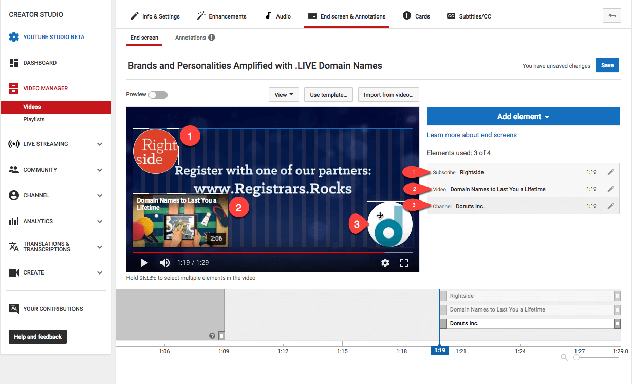
Customize your end screen in the Creator Studio to get your fans to click to see more content.
Designing Your End Screen to Drive Action and Clicks to Your Website
YouTube only lets you select which of the above elements you want to include, with some limited options for resizing and dragging them around, and with no ability to add clear directions. However, you can make choices with the elements and your own video content to create a screen that gets viewers to do what you want.
Since you know how long your End Screen will be, add text and visual instructions to that part of your video file. Include text near your linked elements that specifically tells viewers what to do: “See the rest of the series” or “Subscribe here” or “Click here to get tickets.” And don’t forget to include the text of your short link along with verbal and visual instructions to go there for whatever you’re promoting.
Cards: Interactive Elements Throughout Your Video
Cards are useful little widgets you can insert anywhere in your video, to drive all kinds of actions from your viewers. As with End Screens, you can’t link to external sites, but you can use:
Channel Cards: Recommend one of your other channels or that of a contributor or source you want to endorse.
Donation Cards: Direct your viewers towards U.S.-based nonprofits – it’s especially useful if you are working for a non-profit.
Poll Cards: Create a simple poll with one question and any number of options and tally them. Gather feedback and user research from your viewers to questions you ask in the video itself, such as “What kind of video do you want me to make next?”.
Video & Playlist Cards: Link to other videos and playlists on YouTube to keep a viewer engaged, or to build out your content library with interconnected videos when referencing deep topics or other entries in a series.
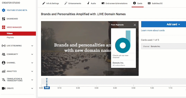
Cards are useful for linking to other content on YouTube.
Designing Your Cards
Cards do have limitations. First, you are restricted to using no more than five different Cards in one video, which limits the amount of content you can link to. Plus, the content all is hidden in the sidebar of a YouTube video. When you reach the time code in a video where a Card is placed, a small “i” icon appears in the upper-righthand corner, with a short teaser message you can write. Once a viewer clicks on that, the sidebar slides over with the linked content and usually a short description you can write.
This is not an ideal attention-grabber, so as before, clearly point out this clickable element with voiceover and visuals in the video itself.
Comments: A Conversation-Starting Link
As a YouTube creator, you can always write and respond to comments on your own videos. And just like in the video description, any link you include is clickable. Viewers are highly likely to scroll to the comments and engage with them. After all, comments are half the fun of YouTube, so including links here makes clicking part of the conversation.
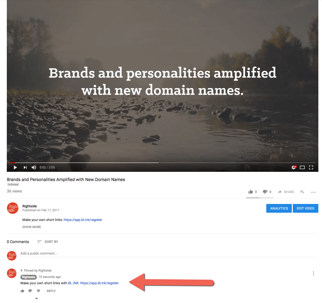
Links in your comments are always clickable.
Responding with Links
Once the conversation about your video gets going, you’re free to respond to comments with clickable links to whatever you’re promoting, as appropriate. If someone asks where they can learn more, there’s no need to tell them that they missed the link in the description, just reply helpfully with the link. Commenters appreciate when brands and businesses engage with a helping hand.
Pinning Your Comments
As the video’s creator, you have the power to pin a single comment to the top of the comments thread. If you want to make your link the first thing people see when they scroll to the comments, you can do that, helping it be highly visible. You can even point it out in the video itself, saying “check out the link pinned to the comments.” Any extra call to action helps.
Short Links in Comments
Just like anywhere else in your YouTube video, it’s better to put in a short link with tracking data so you can learn how effective it is. You could even add separate tags to the link in the backend that identify it as a “comment thread” link, so you’ll learn how well conversations with your audience are working.
Strengthen Your YouTube Link Strategy with BL.INK
YouTube has good reason to restrict its in-video links to more trustworthy, established channels, but that doesn’t mean you have to let the big players get all the benefits from the platform. Use the above linking tips to beat the system when your channel is small, and to get more from the system once your channel is big. Take your YouTube marketing to the next level by using BL.INK to get trackable engagement through highly clickable, easy-to-read short links.
Sign up with BL.INK today.

